4. System Design
The computer package documented in this thesis has undergone
a number of changes since the original design, both as a result
of new ideas, and as a response to user-testing. The following
section looks at some general features of the package, at details
of the various modules of the package, and briefly mentions, some
of the changes that have taken place. Full details of changes to
the package which have been implemented can be found in chapter 6,
and ideas for proposed changes in chapter 7.
Initially, the idea was to produce an easy to use computer
system which would allow children to describe people, places,
and feelings. Most of the psychologists on the team had little
or no idea about what was possible within a Macintosh computer
program, and so a lot of time was spent discussing different
interface possibilities, and ways of asking questions that would
allow the child sufficient scope to be able to use the system,
without getting lost in its intricacies. The approach that was
adopted was the production of a number of different program modules.
The interface to these could be designed by the whole team,
coded by the programmer, and tested on children. Modifications
could then be made if appropriate. From the start the intention
was to utilise the full graphical and audio facilities of the
Macintosh to produce something which a child would find fun to use.
In order to do this it was necessary to consider how the system would
interact with the child.
4.1 General Interface Items
4.1.1 Textual Input
In the initial stages it was hoped that we could produce a package
which needed no textual input whatsoever. It had been assumed that
a keyboard would be an obstacle to communicating with the child.
It was discovered on the first tests of the package with children
in the target age-range, that a keyboard is something that they have
all met, and know how to use. It was decided that it was practical to
use the keyboard for a number of tasks, and in order to make the
keyboard less difficult to use its response was simplified in a number of ways:
1) Key repeat is turned off, so keys do not accidentally repeat
if a user holds down a key for too long. Users who are unfamiliar
with computer keyboards tend to be put off by keys which repeat too
quickly. Additionally, the perception of "too quickly" varies from
user to user.
2) Only a particular set of characters are permitted - preventing
the entry of erroneous characters, or unwanted symbols.
3) A button, marked "oops", is provided next to the text-input box.
When clicked, it will delete everything that has been typed into the
current text box so that users do not need to understand the concept
of the backspace key. Since key-repeat is disabled it is easier to
completely delete a piece of text that was typed in error with the
oops button, than having to press the backspace key repeatedly.
However, the backspace key was left operational since it was discovered
that most of the target group knew about its use.
These modifications to the Macintosh interface were made to simplify
the interface for young children, whilst not being off-putting to older
children and adults. One valuable aspect of asking the child to type
information, is that it tells the interviewer about the abilities of
the child. It may show that a child is going to have spelling difficulties
(though this may be obvious only if the child types more than their
first name etc.).
4.1.2 Messages to Users
In order to make the interface as user-friendly as possible, a decision
was made to incorporate an animated animal character who could announce
messages to the user, rather than the typical computer text-based message
system. Text-based systems are able to present messages to users in a form
which is readily understandable providing sufficient thought is given to
framing the messages appropriately. However, it was thought that a package
employing such an interface would be less likely to succeed, as a wholly
text-based system would be less likely to capture the attention of children.
The initial form the "friendly" interface took was of an animated talking
Moose, whose speech was produced using a standard Macintosh phoneme-based
voice synthesiser called "MacinTalk". Sentences were constructed using
phonemes and these were incorporated into early versions of the package.
The phoneme-based system gave the power to create a vocabulary of great
complexity whilst saving on storage requirements, but at the cost of decreased
clarity. This system was tested on subject groups of children within the age
range for the package. It was discovered during tests on small groups of
children, that they initially had great difficulty understanding such speech,
especially if the sound generated was not amplified by an external device,
but that most of them would eventually pick up the "accent" of the synthesiser.
A further problem was that such speech could at best provide words that a
listener could only guess at, particularly some of the basic speech sounds,
such as "ing", which are notoriously difficult to reproduce on a phoneme-based
synthesiser. Words that contained these particular phonemes had to be avoided.
For these reasons it was decided the MacinTalk system for generating speech was
not good enough, and so the search for another speech system began.
The next step was to use a system of individual words, put together in real
time to produce the desired sentences. This system utilised a bird character,
animated by showing consecutively one of a set of three bird animation
frames (figure 4.1), with the bird's beak in different stages of opening,
apparently synchronised to the words spoken. A female voice was used,
as it was thought likely to be less threatening to the child. This
speech system gave greater clarity, but at a cost of increased storage
of more than 800 times as much for a few sentences compared with the
phoneme-based approach. Another problem with the stored-word system
is the fixed inflection in the individual words, giving a very stilted
sound. Whilst not an ideal system, it was an improvement on the previous
system and was adequate for demonstration and test purposes.

fig. 4.1 - three frames of the different positions of the talking bird
The use of such a speech system was designed in such a way as to enable
the simple addition of extra words and phrases, and even the use of
alternate languages (see Appendix E). All the words and sentences
used by the package for particular situations are stored in a
separate file. The one which the package normally uses is called
"Standard", and the file to be used can be selected when the package
starts up by clicking on an alternate file of words and sentences.
Any other voice files will add to the storage requirements of the
package as a whole, but it is envisaged that anyone using the package
would normally have a single voice file to use with the package, rather
than many voice files, taking up large amounts of disk space. This
system has been modified to permit the bird to display its spoken text
as written text in a speech balloon (see figures 4.2 and 4.3). This
gives both a visual back-up to the sound, and could act as an aid to
those who may have hearing difficulties.
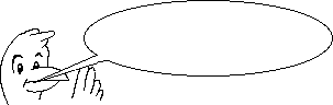
fig. 4.2 - bird animation frame complete with speech balloon.

fig. 4.3 - the three bird frames complete with part of the speech bubble.
Looking ahead to the next stage of speech support, and where the
operating system of the host Macintosh is of a version that
supports the compression software required, a technique will be
employed that utilises complete phrases, stored as compressed sounds.
Two compression ratios are available in Macintosh system software
version 6.07 and above, these being 3:1 and 6:1. Empirical tests
will be performed to discover the optimum compression ratio. This
new system will give sentences of great clarity if the individual
phrases are not compressed too much. A system was added to the package,
which allowed the operator of the package to turn off the bird
animated character whilst maintaining the spoken words. It was
felt that in some cases, the animated character might be inappropriate,
so an alternate character can be used. If the speech file being
used contains an appropriate sequence of pictures then these
will be used instead of the standard bird character. These
options allows the operator of the package to choose the style
of an important part of the "friendly interface".
A further possibility for future expansion is the use of a recent
addition to the Macintosh Operating System, a feature called
"QuickTime". This permits the storage of full-motion video,
complete with sound. QuickTime uses a compression system to reduce
the storage requirements of video and sound, which would otherwise
be excessive. QuickTime will permit the package to have video sequences
of a real person speaking, which will be of particular importance if,
for example, the person speaking also uses sign-language. The quality
of the video reproduction of QuickTime, should be sufficient for
sign-language, and possibly also for lip-reading. QuickTime is
available to any colour-capable Macintosh computer.
4.1.3 The Sticky Finger
A number of individuals who had never used a Macintosh before
were asked to use the mouse to operate a program. From these simple
tests it was determined that some people without "mouse expertise"
found it difficult to hold down the mouse button while moving the
mouse (known as "dragging" the mouse), which is a standard operation
for the Macintosh user interface. Many people experience this
difficulty, and some of the test computers used a "track ball" as
their mouse, which was even more difficult for some people to move
while holding down the "mouse"-button. To overcome these problems
the concept of the "sticky finger" was created, where items that may
be moved with the mouse, stick to it when the mouse is clicked on
them, with the cursor then changing to a grabbing hand (figure 4.4).
Any item which will stick when it is clicked upon causes the mouse
cursor to change into a hand with a pointing finger (the "pointing hand")
whenever the mouse cursor moves near or over them. All those parts of
the package which need things to be dragged around utilise this effect
in an attempt to provide consistency across the various modules.

fig. 4.4 - the "grabbing hand" and "pointing hand" cursors
The package consists of a number of modules:
4.2.1 Introduction
This module presents the child with a picture of a boy and girl from
which they can select their gender. The child is then prompted to
enter their name and age. The gender information is used to set the
gender of material presented in other sections of the package. The
answers to these questions can be verified with known information about
the child.
4.2.2 Emotions I
In this module a view of an individual of the same gender as the child is
presented. The child may select an expression from a palette of seven
emotional expressions, and talk about them. This allows the interviewer
to discover if the child understands the emotions represented in the
palette, and to ask the child to think about events that may have a
specific emotional aspect. It is designed to be used in whatever way
the interviewer thinks is appropriate, and information gleaned from its
use can be used to tailor the way in which the interviewer presents the
other modules - for example information about the child's use of language.
4.2.3 Emotions II - similar to Emotions I except, by
default, eleven different scenes are presented featuring an individual
of the same gender as the child (see appendix A for pictures of the
scenes). The child chooses an expression from the palette that they
believe is appropriate to the scene in question. The standard set of
scenes allow the interviewer to explore the child's understanding of
the emotions represented in the emotional palette. This module can be
used with a set of alternative scenes, selected by the interviewer
from a collection of many different scenes, with specific features.
4.2.4 Buildings - Used to select a building or place
from a range of alternatives. The information gathered by this module
about locations is likely to be verifiable, and can be used as an
indicator that the child is using the package reliably. This module
can be used to permit the child to choose a building to represent any
place that the interviewer wishes them to talk about.
4.2.5 People - Permits the selection of one or more
individuals (usually associated with a place). This is used initially
to get the child to describe the people who live in their primary residence.
By populating a location the child can be asked questions about how
they feel with individuals when they are in certain locations.
4.2.6 Emotions & People - For each of the seven emotional
expressions in the palette, the child is able to select people that they
have felt that emotion with. The people that the child chooses are ones
who they have previously associated with a place in the buildings module.
4.2.7 Somatic Experiences - Allows the marking of pain
sites on pictures of the front and back views of a child. Pain sites may
then have a shape, size, and "throb" associated with them. This module is
not based on any existing aspect of the SAGE system.
4.2.8 Environment - Used to place items of furniture
into a "room". This module was initially thought of as an adjunct to the
buildings module.
These modules have been designed and produced at various stages in
the package development, and there are plans for some further modules
to be introduced in the future. These are discussed in chapter 7.
A number of the modules of the package can be easily customised in
order to modify the way in which they are presented to a particular
user. This is possible because when certain modules initialise, they
check to see what resources are available to them, and are able to
modify their behaviour if certain alternate resources are found. As
described in appendix B.5, Macintosh files consist of two parts or
forks, and one of these holds the resources that the
package uses. (Resources are discussed in appendix B.6). More details
on the resources seen in typical Macintosh programs can be found in
Appendix E and Appendix F.
This ability for simple customisation is designed
to allow the package a degree of flexibility, and it is envisaged that
tools will be provided to users to permit their customisation of the
package, where this is within guidelines defined by the psychologists
on the team.
A variety of tools are used in different parts of the package to
allow the user to choose from a number of available options. It is
important, when looking at the design of such tools, to bear in
mind three key questions [Vertelney et al, 1990]:
- Usability - will users be able to learn to interact efficiently
with the tools?
- Functionality - what functions and controls are available to get
optimal use of the tools?
- Visual Communication and Aesthetics - how do the visual appearance and
spatial location of the different elements in the tools affect their
functionality?
We will look at each of the tools in the various modules in turn.
4.4.1 The Emotions Tool
The user is presented with a scene containing a child with a blank face,
and a rectangle comprising a set of seven equal-sized rectangles arranged
horizontally, each of which contains a different emotional expression (known
as the emotional palette, or emotions tool - see
figure 4.5). Clicking on one of the rectangles transfers the expression within
to the face of the child in the scene, and puts an indicator, a coloured
rectangle, around the chosen expression in the tool. Once an expression has
been chosen, though it may be replaced by a different expression, it is not
possible to subsequently have no expression. The tool has no facility for
removal - only replacing, since the tool is used when a selection is mandatory.
The emotions tool stays in place after an expression is chosen and acts as a
visual reference, so that the child can compare the one they have chosen with
the remaining expressions. Figure 4.6 shows two views of a scene, the first
without an expression, and the second after the frightened expression has been
added. It is important to note that the user may go on to change the
expression on the second view to a different one simply by selecting an
alternate expression from the tool.
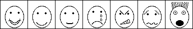
fig. 4.5 - the emotions tool
The seven different stylised emotions represented here, were intended
to give a sufficient breadth of expression. They have been designated
"very happy", "happy", "neutral", "sad", "angry", "ambivalent", and
"scared". These expressions evolved from designs which were based upon
stylised emotions as represented on the faces of characters in children's
comics. At the outset children may not recognise such stylised emotions,
and only come to know them through the use of them in cartoons. These
expressions were tested on groups of children in the target age, to see
if they assigned to them the same "feelings" that we had designed them to
represent. More details on the test results are given in Chapter 5, and
modifications made as a result are documented in chapter 6. Following adjustments
to the designs and further tests, it was possible to accept the expressions,
and to be able to say that children assigned the same sorts of feelings to them,
with minimal deviation, as those that we had originally intended to convey.
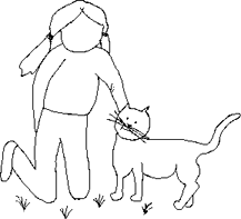
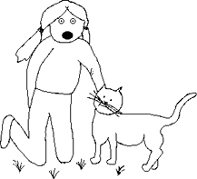
fig. 4.6 - example of a scene without expression and with the "new" frightened
expression.
4.4.2 The Scrapbook - A Rejected Tool
Originally a scrapbook (figure 4.7) was used to present a series of
pictures of items, where the intention was to get the user to choose
just one of them. The scrapbook was based on the Notepad and Scrapbook
programs for the Macintosh. These two programs have been part of the
Macintosh System software since the earliest Macintosh computers. This
meant that they were well known to anyone who had used a Macintosh. For
anyone who had used a Macintosh, which included the whole of the project
team, use of the Scrapbook was intuitive, however, this obscured the
fact that our target audience of children found it too difficult to use.
In the initial design for the Scrapbook browser, the user looked
through the scrapbook, going forwards or backwards by clicking in the
"dog-eared" corner of the page, and then when they decided on the item
that they wanted they clicked on the item, whereupon the page containing
that item was torn out of the scrapbook and presented at the side of the
book. The scrapbook itself was closed. If the user decided that they
would like to look again they could go back to browsing the scrapbook.
If they chose a different item, then that was torn out of the scrapbook,
and the initial choice returned to the book, where the process could start
again. When the user was finally happy with the choice that they had made,
they clicked on the "OK" button presented elsewhere on the screen, in the
area which was set aside for such buttons. This initial Scrapbook design was
refined in the light of user-testing and a slightly different scheme was
employed. Since the user had already met, and would meet again later, the
idea of dragging objects, the way that an item was chosen from the Scrapbook
was modified, and the new system was to be that of dragging the item from the
page of the Scrapbook to a pin-board, on to which the dragged picture was
placed. If a different picture was dragged there, the initial picture was
returned to the Scrapbook. The picture on the pin-board, could also be dragged
back onto the Scrapbook, in order to deselect it.
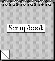
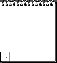
fig. 4.7 - the two different views of the scrapbook - closed and open.
The scrapbook tool is theoretically able to utilise any drawing as a
representation of a dwelling. In practice it is intended that the person
supervising the running of the package will have selected an appropriate
set of pictures for the particular child who is to use it. In this way
it becomes simple to target the package for a particular user. This is
done is by the use of a custom resource type. Resources are discussed
in appendix B.6 and section 4.3, with further
details on the definition
of resources in Appendix E and resource types in Appendix F.
The "Bild"resource is a custom resource, designed to be used by this package.
It contains information relating to the picture of the building. It
includes, for example, the rectangle which defines the door to the house,
enabling the package to place the number of the house on its door! There
is one resource for each house picture. All pictures corresponding to
such resources are placed into the scrapbook for display.
This tool was initially tested on a small group of children, who were able,
with some difficulty, to operate it and select from it a picture of the
house that they lived in. A further problem was encountered with use
of the Scrapbook for the selection of houses, in that the pictures
of the different kinds of houses were not specific enough to be recognised
by the user. It would be difficult and unwieldy to represent all the
different possible types of dwellings, and so the mechanism of the Scrapbook
for use for choosing a dwelling will be replaced by another system,
possibly one that presents the user with basic building blocks, and
then allows them to put together a more representative image of their own
house by dragging extra items onto the picture.
4.4.3 Family Chooser
The user is presented with a "global family" from which individuals,
and other families can be created.
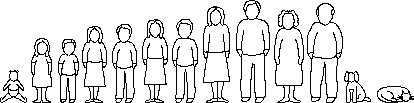
fig. 4.8 - the "global" family
This family was created to represent a reasonable set of alternatives
for height and/or age (figure 4.8). It can be customised for a particular
target user, to include particular types of individual. The users click
he member of the family that they wish to select. The coordinates occupied
by each member of the global family are compared with the coordinates of
the mouse-click. If the mouse-click position lies within the coordinates
occupied by a global-family member then this family member is selected. As
each person is selected, they are named by the child in response to a dialog
box. This is so that they may be referred to later, and as a reminder of who
has been chosen (and hence who remains to be chosen), since the same representation
may be used to depict a number of different people. As they are selected,
a reminder of the chosen set are shown in a small window to the top-left of
the main window. This acts as a visual reminder to the child of who has been chosen.
In the original version of this tool, the locations of the members of
the family were hard-coded, their values were written into an array
from constants within the source code of the package. This meant that
in order to adjust the contents of the global family, for example if
we wished to add ethnic characters, the source code of the package
would have to be modified because the positions of all the family
members would be different from the original values. This was deemed
to be too limiting a system. The original module had the ability to
display a family that the user chose from the global family, up to a
limit of 25 persons. As the number of persons chosen made the new
family larger than would fit on the screen, the new family was drawn
at a reduced size, whilst maintaining the height-to-width ratio of
the family members. The routine which drew the new family calculated
a set of coordinates for each family member, in order to determine
when the new family became too wide to fit the screen. It was a logical
extension to use this family drawing routine to draw the global family
as well, and by returning the coordinate information to the calling
routine the information could be used by that part of the program that
watches for a mouse-click on the global family members. This technique
had three distinct advantages:
1. It meant that the global family could be customised without any
changes to the source code of the package at all. There is a resource
of type "Fmly" for each person in the global family. When the package
starts up each "Fmly" resource is found, and the picture associated
with each "Fmly" resource is collected, so that it may represent this
individual in the global family.
2. The routine which drew the family could be reused in another
part of the package, reducing the amount of programming code required.
3. Modifications to the way that families were drawn in all modules
could be achieved by changes to a single drawing routine.
With hindsight it is obvious that this should have been the direction
taken from the outset, but at the time, simplicity of coding had been
the intention, and the routine which drew the selected family had not
been written at that time.
Any sort of picture may be used to represent a "family member",
including animals such as cats and dogs. This feature has been
exploited in the package, to allow adaptations to the original
global family in the light of responses from children who have
used the package. More details of the changes can be found in section
6.6. It is intended that the package as supplied to psychologists will
come with a set of artwork of characters of different ethnic origins,
and that customisation of the global family will be customised using a
program module designed to allow the psychologist to target the operation
of the package more specifically.
4.4.4 Emotions and People
This particular module of the package reuses an existing tool
as an indicator (figure 4.9), and introduces a new tool. The Emotions
tool is used to indicate feelings, so as to facilitate discussion of
the child's experience of those feelings. Each of the seven basic
emotions is presented, along with the question "Have you ever felt
like this?". The emotions themselves are presented in a sequence where
"negative" emotions are interspersed with "positive" ones. The emotions
tool ranges the emotions from positive to negative from left to right.
A dialog box with "Yes" and "No" is also presented, allowing the user
to give their answer.
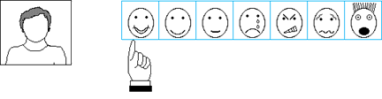
fig. 4.9 - Emotions tool being used as an indicator.
If the user's answer to the question is "No", then the next emotion
in the sequence is presented. If they answer "Yes", then a short
animated sequence takes place, transferring the expression of the
emotion to the head and shoulders picture in the left-hand-corner
of the window, while all the other emotional expressions fade out -
so that only the current one remains (figure 4.10).
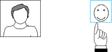
fig. 4.10 - User answers "Yes" to question "Have you ever felt like this?"
After all the emotions have been dealt with a new tool is presented
(figure 4.11). This tool has three parts:
1. The top half of the display shows the family chosen by the user in
the family module.
2. Bottom left is a reminder of the emotion that is being investigated.
3. Most of the bottom half of the display has space for the user,
and can also hold members of the family that they choose.
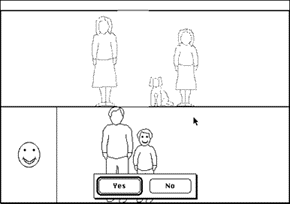
fig. 4.11 - Emotions and People main tool.
The user is asked about each emotion in turn, and may click on a
member of the family with whom they felt that particular emotion.
Upon selecting a family member, the person is moved to the bottom
part of the display to stand beside them, and a Yes/No dialog box
appears to make sure that they really meant to select that person
(figure 4.12).
fig. 4.12 - the user chooses a family member.
If the user clicks "No", then the family member returns to the family
section of the display and returns to its greyed out state. If they
click "Yes", then the family member returns to the family section,
but is drawn in black to highlight it (figure 4.13).
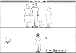
fig. 4.13 - the selected individual returns to the family section of the tool.
The interface documented here is the third implementation of this tool.
Details of the previous versions can be found in section 6.8, and details
of a proposal for a different interface can be found in chapter 7.
4.4.5 Somatic Experiences
Obviously, somatic experiences of most interest to an interviewer consist
of pain and/or discomfort. This tool (figure 4.14) allows the user to mark
pain sites on a representation of themselves, using pain-shapes, some of
which have an animated representation. The tool has the facility for
representing three aspects of pain: location, shape, and size/intensity.
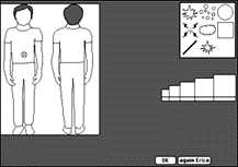
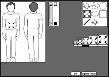
fig. 4.14 Somatic experiences tool. On the left the user has selected
a pain-site by leaving a gremlin mark. On the right the user has clicked
the pain palette and a representation for that pain has replaced the
gremlin. The user may now adjust the size and throb-speed of the pain-spot.
The user is asked about their history of pain, starting with the
idea of pain experienced in the past, and then continuing on to pain
currently being experienced, or the last time the user had pain.
The user is presented with the front and back views of a child of
the appropriate gender, and then asked to mark an area where they
had pain, by clicking which leaves a gremlin mark. They are then able
to choose from a palette of different types of pain representation.
The palette contains a number of pictures of pain types. The pictures
themselves may be a sequence of pictures, i.e. an animated representation,
representing a pain type; for example a flashing bolt of lightning.
Upon selecting a pain type, a standard-sized representation of it will
transfer to the site of the pain marked by the user. They then have
the facility for choosing one of five different sizes/intensities for
the pain spot. The final stage is to set a throb-speed for the pain
spot. This is achieved by manipulating the slider control upwards to
increase, or downwards to decrease the rate of throb.
There are three main parts to the somatic experiences tool (figure 4.15).
The pain-type palette. This appears on the
right-hand-side of the somatic experiences tool window and is a dynamic
item: it re-sizes depending on the number of different pain-type
representations that are available when the tool is initialised.
The standard set of pain types in the tool were based on children's
drawings of pain or hurt.
The size/intensity palette. This was designed to
offer a range of alternative sizes without making the manipulation
of size a complicated matter.
The throb-speed controller. This uses a standard
Macintosh interface item: a slider control, usually found on scrolling windows.
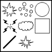

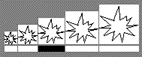
fig. 4.15 The three main parts to the somatic experiences tool.
Pain-type palette, throb-slider and size/intensity palette.
Changes which were made to the somatic experiences module over
the course of its development are detailed in section 6.9, and
results from trials using it are presented in chapter 5.
4.4.6 The Slide-Bar
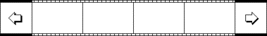
fig. 4.16 - the slide-bar (shown with all four slide positions empty).
The slide-bar is a tool which permits the choosing of an item from
a selection of items, and the subsequent placing of the chosen item at
a location in the main window. The slide-bar (figure 4.16) displays up
to four items at once from which a selection can be made. It can display
more than four items by utilising the arrow buttons at both ends of the
bar to scroll through the set of "slides" on display. Selection of items
from the slide-bar is made by clicking on a slide. This causes four
things to happen (figure 4.17):
1. A rising note sound is played to indicate something being picked up.
2. A full-size copy of the selected item appears near to the cursor.
3. The cursor becomes the "sticky finger" (see 4.1.3).
4. The slide bar becomes black, obscuring all the other slides.
As the user moves the mouse (figure 4.18) the selected item follows it
(see appendix G for details of the animation algorithm used). To place the
item in the main window the user clicks the mouse again. This releases the
item from the sticky-finger (figure 4.19), and plays a falling note sound to
suggest something being dropped. If the user had clicked the black slide-bar
area while the item was attached to the cursor, the item would have returned
to the slide bar, as though it had never been selected, and no sound would
have played.
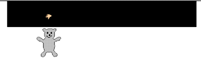
fig. 4.17 The mouse has been clicked over the teddy-bear slide, and a
teddy-bear picture has appeared near to the cursor in the main area of the
display, while the slide-bar itself has turned black.
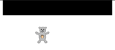
fig. 4.18. The teddy-bear picture is connected to the sticky-finger cursor,
and follows it as it is moved by the user.
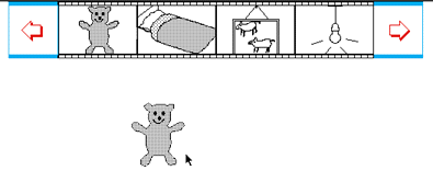
fig. 4.19 The mouse has been clicked, releasing the teddy-bear picture.
The slide-bar is redrawn to show that other items may now be selected.
The slide bar is an attempt to present the user with an interface in
which it is easy to select from a number of alternatives, but where
other items are in view in order to have a visual reference to them.
Note that where the choice is between similar items, it would be
appropriate to group them together. The visual display of the slide-bar
acts as an aid to memory. Section 7.1.1 discusses a possible alternative
use for the slide bar.
Unlike the scrapbook which wraps around to the beginning if the user
tries to move past the last "page", the slide-bar has definite start
and end points. These are marked by "slides" which are grey, and which
cannot be selected as items (figure 4.20). Any attempt to move the
slide-bar further past the end points results in a spoken message from
the bird character telling the user to "click the other arrow to go the
other way".
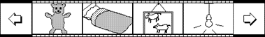
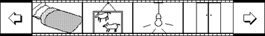
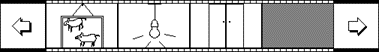
fig. 4.20 - three views of the slide bar as the left-hand-arrow is
clicked repeatedly (i.e. the slides move to the left). Note in the
last view the right-most item is a grey, empty slide which cannot be
selected.
There are two ways to implement scrolling, based on different physical
models of the relationship between the window and the data. These are
referred to as the "moving data", and "moving window" models. The
individual slides in the slide-bar scroll in the direction of the arrow
that is clicked, an example of the "moving data" model. The window stays
put and data "moves" underneath it. This directly conflicts with the
standard Macintosh scroll-bar control, such as found on word-processor
documents, which scrolls the contents of the window in the opposite
direction (figure 4.21, and 4.22). This alternate scrolling form is the
"moving window" model. The window "moves" to reveal the data underneath
it.
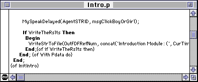
fig. 4.21 The window contents are too large to view all at once and are
truncated on the right.
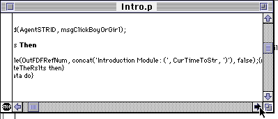
fig. 4.22 Clicking the right-hand arrow causes the window contents to
scroll left.
Although anecdotal evidence [Billingsley, 1988] suggests that
moving window" is the user's preferred windowing mode, it is likely
that this is due to the metaphor of the windowing system. The
slide-bar was designed to scroll the slides in the same direction
that the arrow points, since it was thought that this was likely to
be more intuitive for the target audience. The metaphor for the slide-bar
is that of a holder for slides. In order to see slides off to one side
the existing slides move out of the way. This suggests that the "moving data"
model more accurately reflects the metaphor. This is one theory that
remains to be tested, since the tool has not been extensively piloted
on children.
back to Chapter 3. forward to Chapter 5